
Feature: Graphic design
In the right place
In this extract from his book, Gerald Cinamon explains how he brought integrated book design to Penguin – first at his kitchen table in the 1960s; later as chief designer

An Atlas of Typeforms
As a sidebar to ‘Quiet man of letters’, Simon Esterson talks about his early encounters with this celebrated book by Alan Bartram and James Sutton
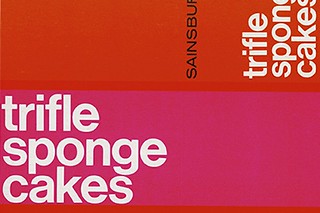
Sans serifs in suburbia
Sainsbury’s brought 1960s Modernism to the kitchen cupboard
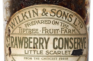
Identity preserved
The labels for Tiptree jams stand out by staying the same
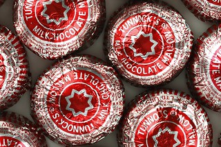
Sticky business
The dead-wrapped Tunnock’s Tea Cake is both hipster treat and Scottish design classic
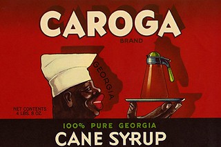
Leftovers with a bad taste
In the past century the use of ‘trade characters’ built brand loyalty while reinforcing stereotypes
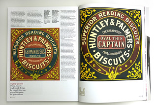
Tightly packed
Owen Jones’s trademark design for biscuit tins has stayed the same for generations
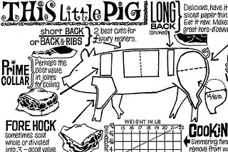
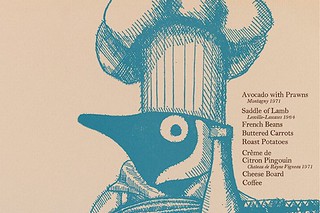
Fry like a spy
The comic strip simplicity of Len Deighton’s Action Cook Book taught bachelors how to cook
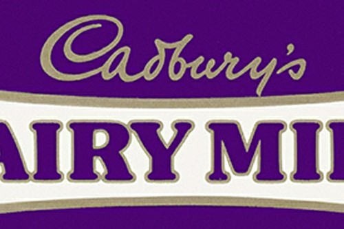
Purple reign
One of the world’s oldest chocolate bars has kept the same colour through thick and thin
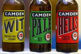
Labelled with love
The new craft beers come in bottles, ideal for trendy bars and hipsters who want to display what they’re drinking. By Paul Keers