
Blog: Design history
13 March 2009

The Peter Saville principle
sara martin
5 March 2009
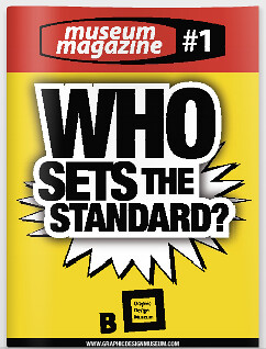
Museum and magazine
the events department
23 February 2009
Collection by Matt Willey
5 February 2009
The scariest taboo?
books received
22 January 2009
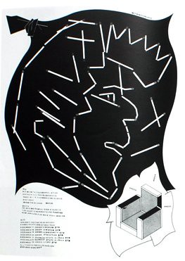
Treasure trove of graphic resistance
noel douglas
19 December 2008
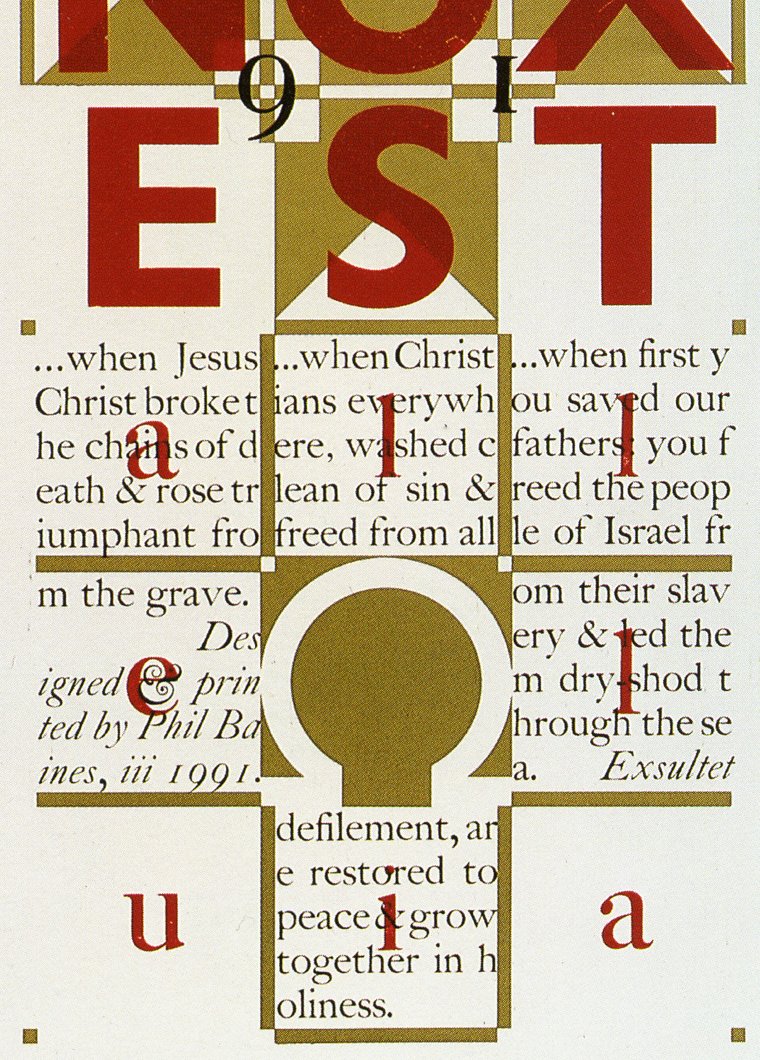
Phil’s top type hits
the type department
18 December 2008
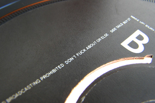
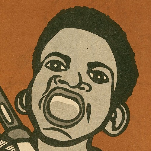
Reasons to be cheerful, part 2
I received an exciting package through the post the other day, a mint copy of Ian Dury’s ‘What A Waste’
12 December 2008
Reasons to be cheerful, part 1
10 December 2008
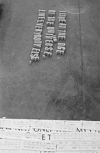
Milestone at the edge of the map
hamish thompson
15 November 2008
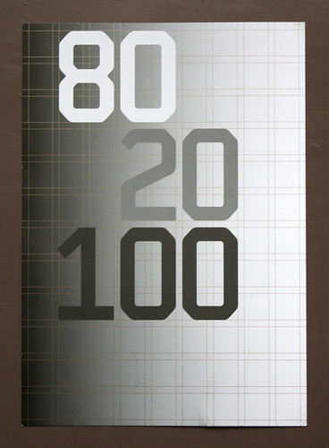
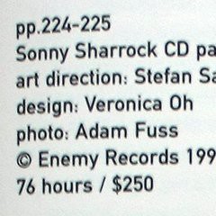
Crouwel at ‘80 20 100’
the picture department